1-800 Contacts
1-800 Contacts is an online retailer of contact lenses. Started in 1995, it disrupted the contact lens industry by allowing customers to buy their contacts from someone other than their doctor which saves them time and money.
During my time here, I’ve nurtured and evolved the brand from its white and clinical origins to its current colorful, approachable, and friendly vibe. I worked with departments across the company (marketing, product development, events, legal, government affairs – all of them) on their initiatives, as well as helped create a private label contact lens brand, AquaSoft, and Lumen Optical, a chain of stores in the Chicago area. I’ve also helped grow and build the creative team from a small scrappy team of three to a robust team of specialists including copywriters and product designers.
Over the years I’ve been involved in a few brand refreshes with the help of external agencies. While we’ve modified words, refreshed colors, added a mark, and introduced a lovable eyeball, one thing remains the same: the constant pursuit of a better way. It’s been in the company’s DNA from the beginning and it continues to guide them into the future.
Manifesto
Brand book
Roles: creative direction, art direction, design
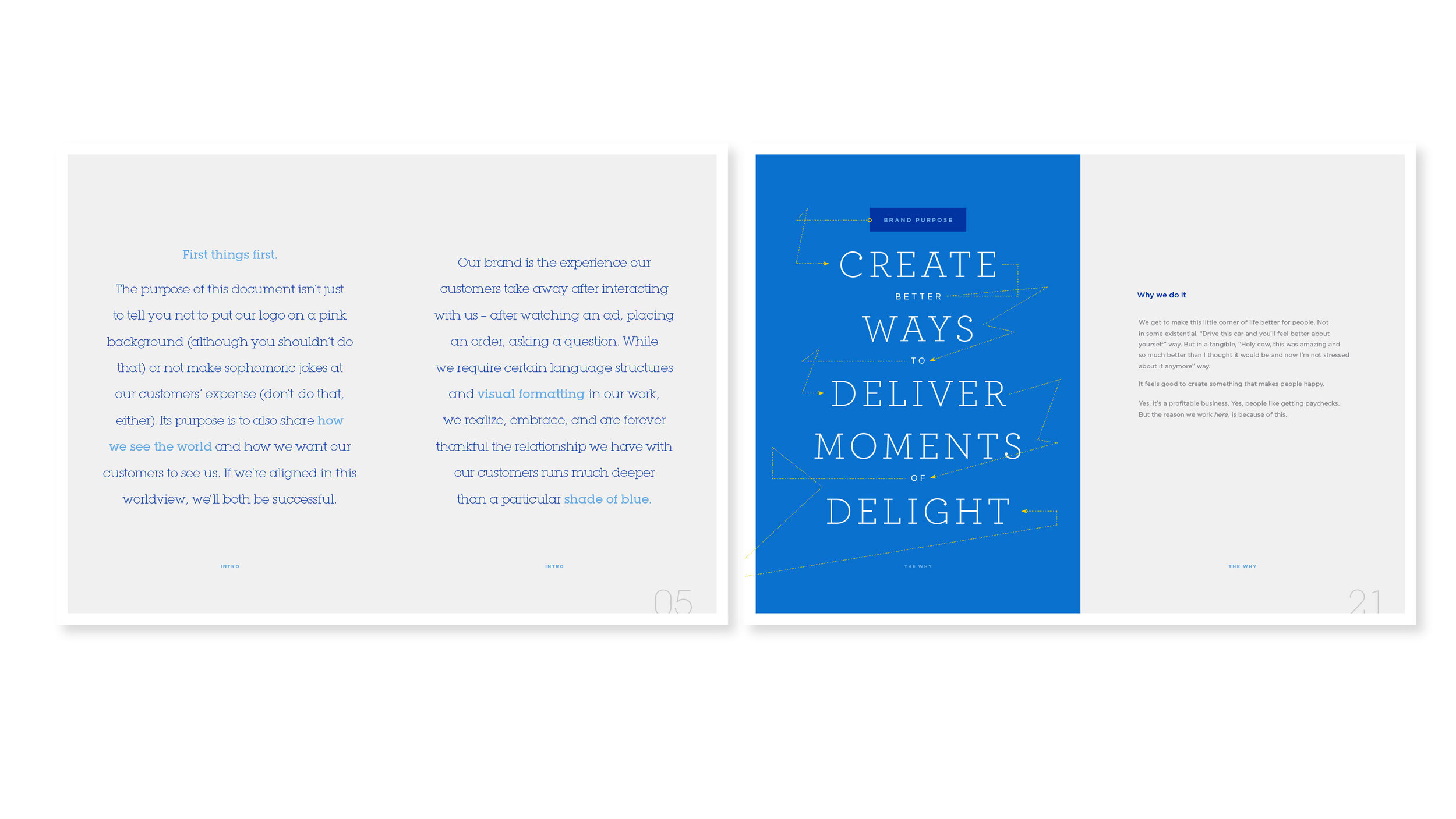
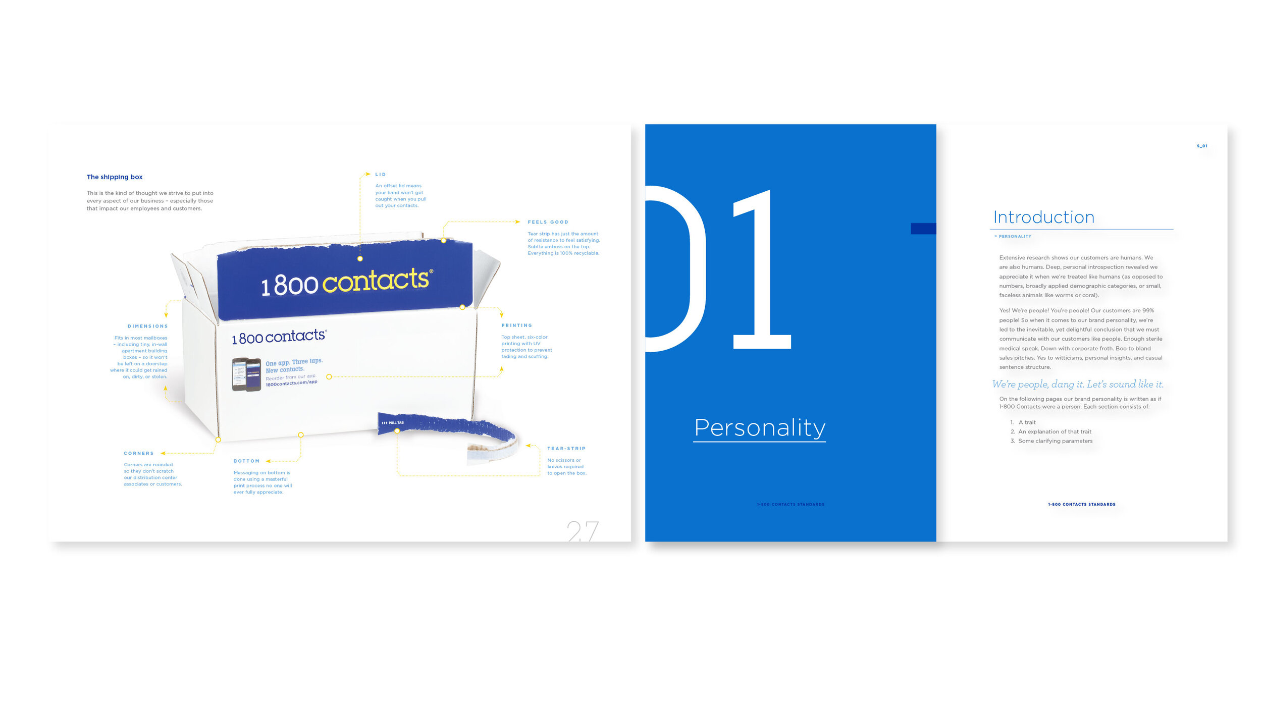
Created internally for employees and external partners to understand that the 1-800 Contacts brand is more than a logo and blue colors.
Seymour Guidelines
Roles: creative direction, art direction, strategy
In 2019 we introduced Seymour, a lovable eyeball with arms and legs to help personify the brand. As we ramped up his use, there was a constant demand for different poses and expressions to fit different marketing needs. Inconsistencies quickly arose. A guideline was needed to combat inconsistencies as well as help with speed in creating new iterations.
Roles: creative direction, art direction, design, strategy
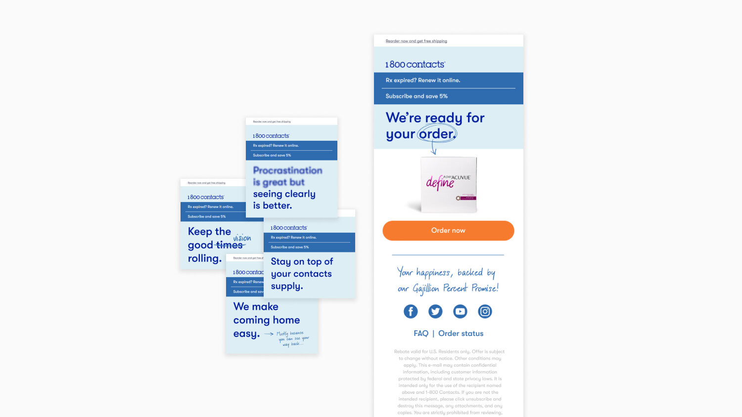
Emails have been 1-800 Contact’s bread and butter for repeat customers. Early on we figured out that when we send email, people order. Over the years we’ve tested many different messages, but for some reason we can’t beat “We’re ready for your order,” but we also found that you can’t send the same email over and over. We currently rotate other high performing messages as well as continuing to test new ones.
Packaging
Roles: creative direction, art direction, design, print production
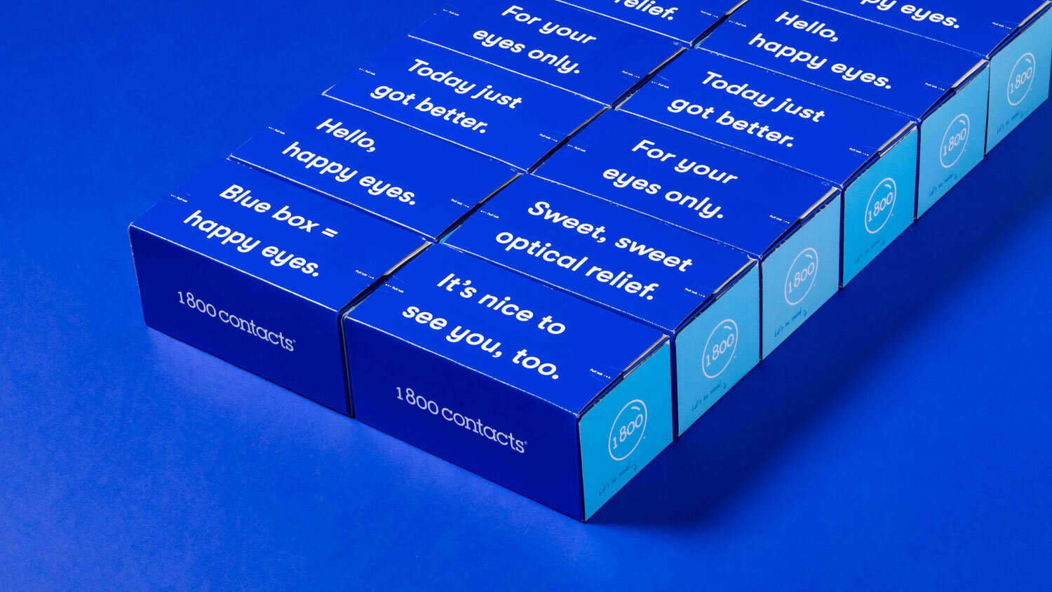
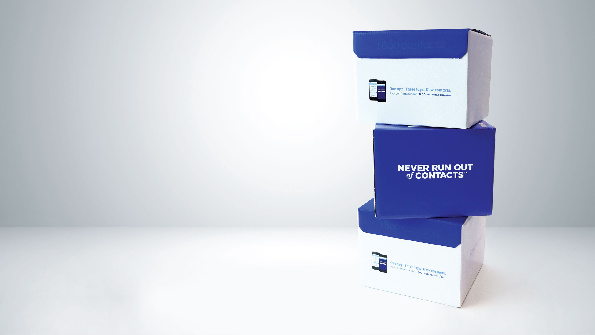
Without brick and mortar, the shipping box is the only tangible interaction with 1-800 Contacts and the consumer. It also serves as a billboard as it ships to the end user. They have been referred to as the “Cadillac” of shipping boxes.
Stationery
Roles: creative direction, art direction, design, print production
Building interiors
Roles: creative direction, art direction, design, print production
Event posters
Roles: creative direction, art direction, design
Twice a year as employee appreciation, 1-800 would rent out entire theaters of upcoming blockbuster movies. These were fun projects that allowed the creative team to go outside the boundaries of the brand.
Evolution
During my tenure at 1-800 Contacts I have been directly involved in the evolution of the brand and visual identity.
Logos
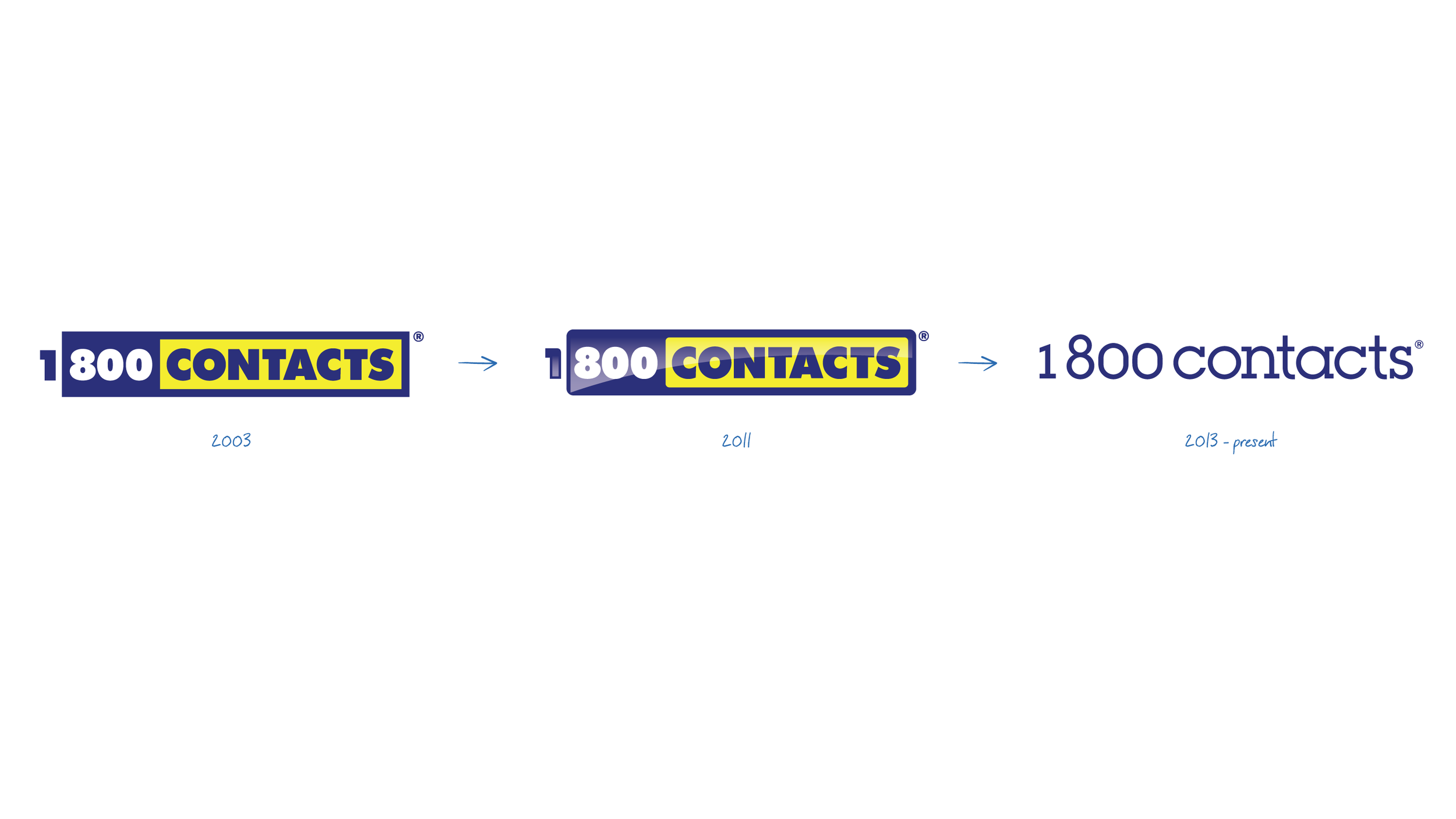
2003 - Internally known as the “battery” logo, this was the logo in use when I first started.
2011 - We rounded the corners and gave it a sheen. It was referred to as the “lickable” logo. We eventually dropped the sheen.
Current - In 2013, it was decided that we needed a logo refresh. We initially farmed it out, but the iterations we received didn’t feel right. So we completely redesigned it internally.
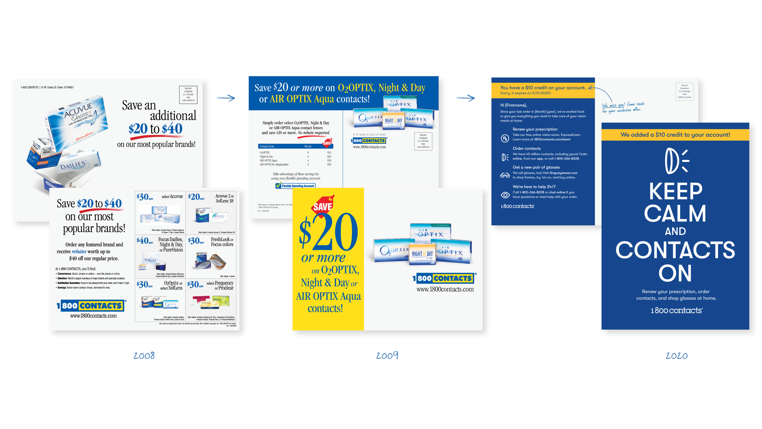
Direct mail
Over time we began to dial in the typography and move away from the grid format and eventually we started doing less direct mail as a whole. In 2018-19 we again refreshed brand with the help of an agency and I began implementing into the direct mail.
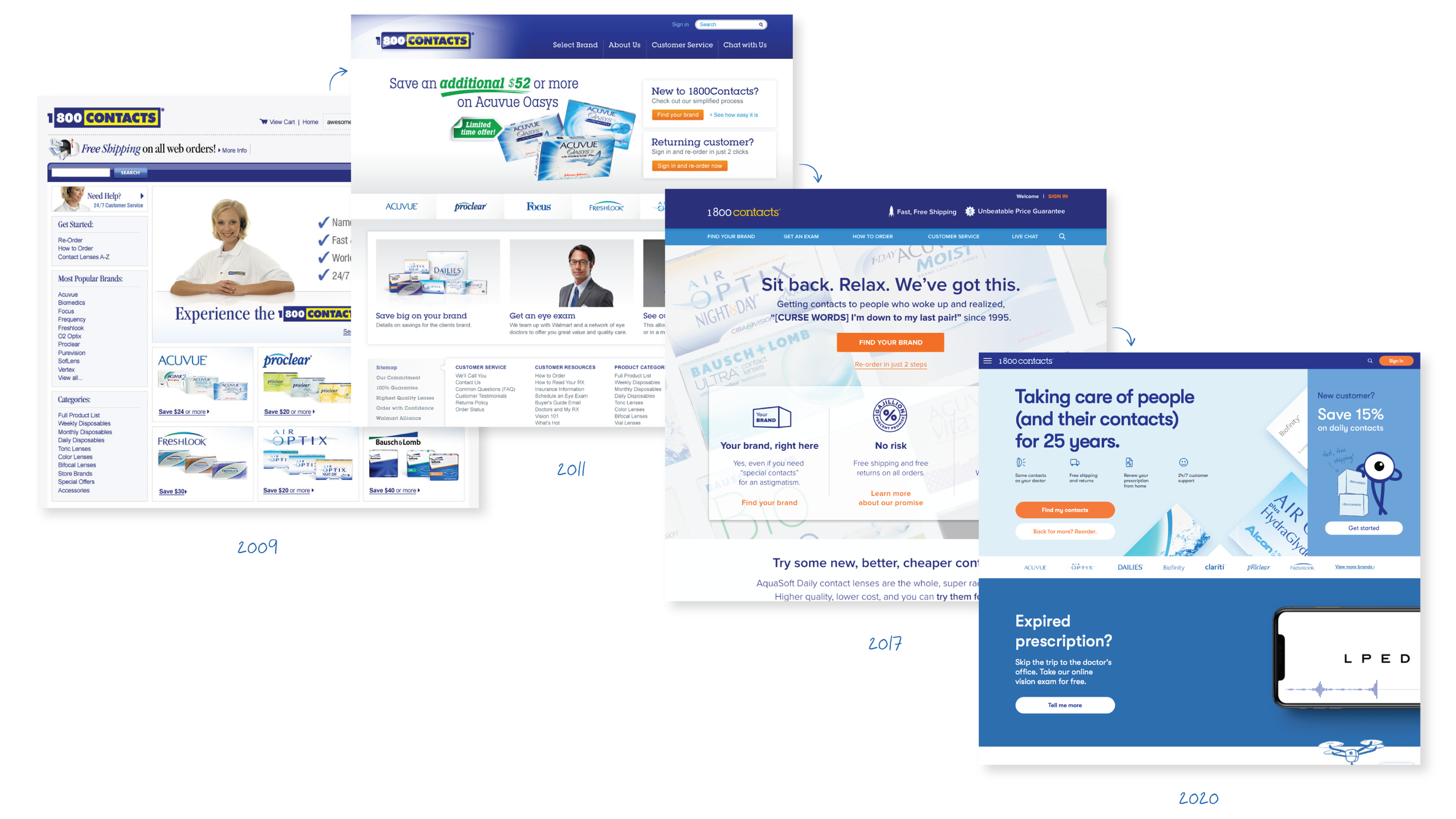
Website
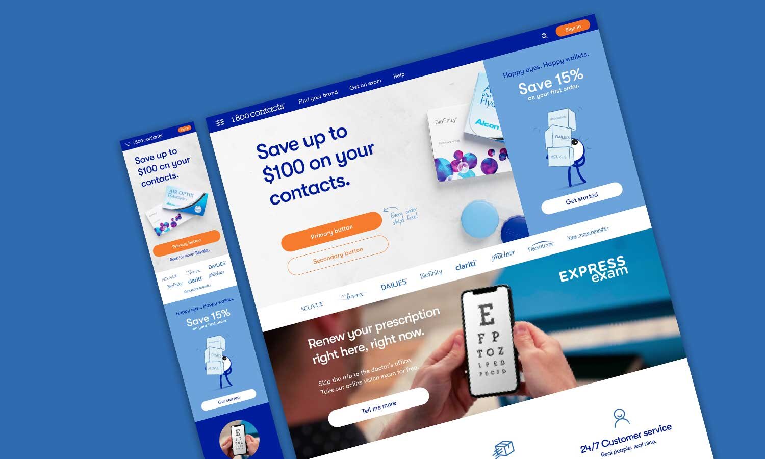
The site has undergone several refreshes over the years always with the goal of simplifying the ordering process.
